Capture Ideas at the Speed of Sketch

Why Visual Notes Beat Linear Lists
The Dual-Coding Boost
Allan Paivio’s dual coding theory suggests we learn better when information is presented both verbally and visually. Sketchnoting exploits this by pairing concise keywords with shapes, arrows, and simple scenes. The second channel gives memory more hooks, improving recognition, recall, and comprehension under time pressure.
Less Jargon, Lower Load
When a speaker floods the room with specialized terms, quick icons and containers act like subtitles for the mind. Replacing long phrases with badges, banners, and directional arrows lowers cognitive load, letting you keep pace. Later, annotations restore detail without losing the clarity captured in the moment.
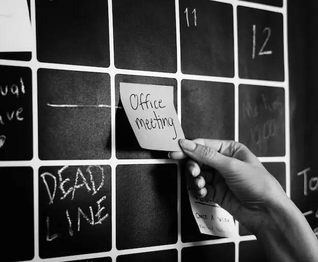
Sticky Landmarks for Memory
Landmarks like stars, frames, and bold connectors create a visual path you can retrace days later. Even if handwriting is rushed, distinctive shapes signal importance and sequence. Peers scanning your page quickly understand what mattered, building shared memory that supports action, decisions, and respectful disagreements.
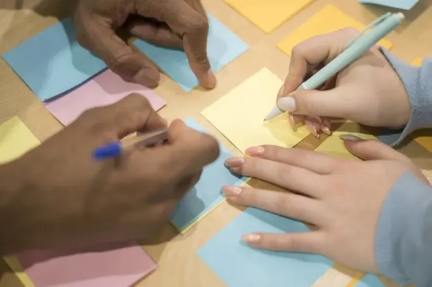
Build a Reusable Visual Vocabulary
01
Shapes that Mean Something
Circles can signal people or ideas, squares make sturdy lists, and triangles point to decisions or warnings. Keep each symbol simple and repeatable at different sizes. By mapping meaning consistently, you eliminate hesitation and keep momentum, even when a presenter jumps topics or accelerates unexpectedly.
02
Connectors that Tell Movement
Arrows, dashed lines, loops, and ladders show relationships, feedback, and growth over time. Choose one arrow style for cause, another for dependency, and a third for emphasis. With clear conventions, readers follow motion intuitively, reconstructing processes without paragraphs of explanation or frantic clarifying conversations afterward.
03
Lettering that Guides the Eye
Use big, bold headers for chunks, small neat body text for details, and a contrasting script for quotes or metaphors. Vary weight and spacing rather than color when speed matters. Consistent lettering creates rhythm, so scanning feels musical, and comprehension rises without extra effort from tired minds.
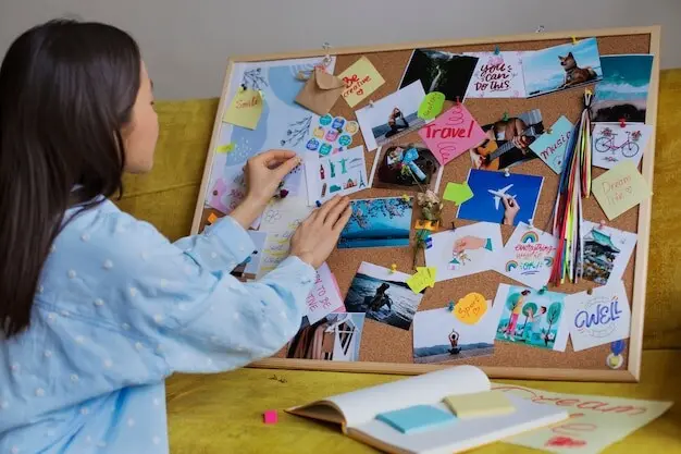
Layouts that Think for You


Listening with Intentional Filters

Chunking Layers in Passes
From Rough to Ready-to-Share

Train Like an Athlete of Attention
All Rights Reserved.